“Everything is designed. Not everything is designed well.”
Brain Reed
Sweat drips down your forehead as you walk into your first board meeting. A sterile room and cold stares greet you and you start to freak out. You know you have amazing research and data to present, but will the higher ups be engaged? Whether you’re a young professional trying to impress your bosses, a student trying to keep the class from falling asleep during our endless mandatory presentations, or someone trying to make the most creative portfolio to apply for the girl/boyfriend position of your dreams, we’ve all run into this problem; how do we make our data look interesting?
- Set Your Goals
You have to know what information you’re going to present before you start designing anything. Look closely at your data and start organizing it. What can be better represented in a visual? What could best be explained in a text? For statistics, especially impressive ones, it is often more effective to use visuals to get your point across. Use colors, size, angles, and positions to differentiate the data that you want pronounced from the rest of the numbers. Condense your data and extract insights. Once you have insights, or the important results from your data, you can use those to choose headlines, text, and what data is important to include.
2. Choose a Theme
Once you have your data you can start to brainstorm a format, or a theme. What colors do you want in your data? What kind of vibe do you want your presentation to have? How will this information be presented? Is this a more creative or professional environment?Is the person you’re applying to date an introvert or an extrovert? All of these are important questions to consider when choosing your theme. Your theme is really just the format in which you’re choosing to present your findings. It can be monochromatic, modern, classic, rustic, hipster, bougie, really anything you can think of. It will help guide your design decisions and how you input your data into your presentation.
3. Mix it Up
Now you get to start playing around with the layout. You have all of your data organized and a theme picked out and now it’s time to get visual. This is a long process but the most rewarding one. Take the same data and try to format and visualize it in different ways. Put it in text, a pie chart, a picture, a flow chart, a headline, and whatever else you can think of. Seeing the data in different forms will help you see which format it looks best in. Play around with it. Have fun. You did all of the hard work already by gathering the data and organizing it, now you get to implement it in a creative way. Your theme will help guide you as to which colors, sizes, and positions to use so now it’s up to you to decide the format.
4. It’s all about Aesthetics
Data? Done. Theme? Chosen. Format? Decided. You’re basically done! All that’s left to do is to make your presentation as visually pleasing as you can. Variations of the same colors, differences in opacity, bold statement headlines; these are all examples of little details you can add that will make your presentation that much better. Anyone can get data, but this is your presentation, so make sure to add a little bit of yourself in there too! Making your presentation unique to you is a sure way to stand out from the crowd and demonstrate effort, creativity, motivation, and initiative. Once you put all the finishing touches on your presentation, you’re done! Congrats on an amazing presentation that will leave everyone inspired and engaged in your topic (and will def land you that s.o. interview) !
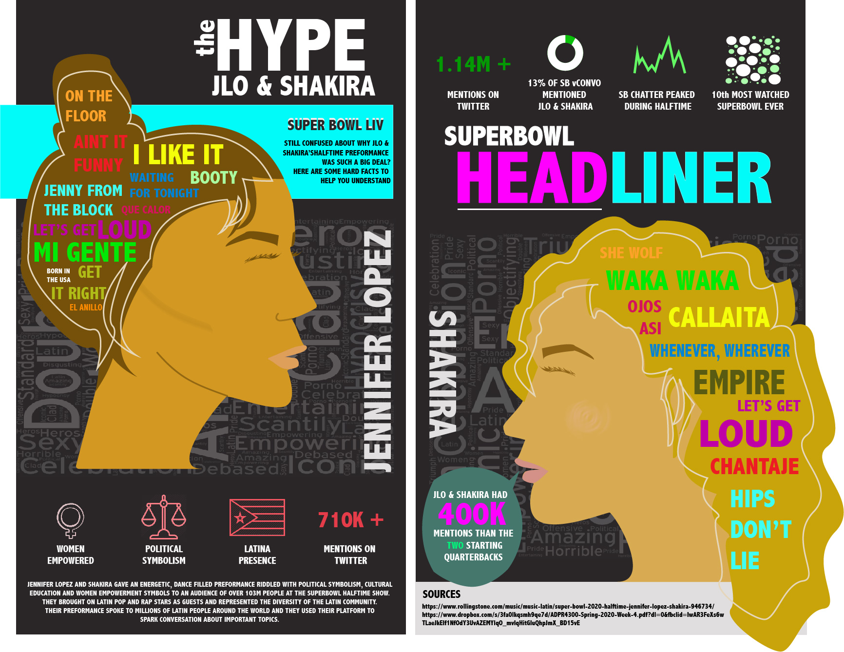
The infographic at the top of the article is one that I made about the Super Bowl halftime show. I chose a different format than the typical infographic because I thought it matched up better with the loud, inspired content I was writing about. I began this process by drawing out JLo and Shakira’s silhouettes in Adobe Illustrator. Once I had a visual of where the data was going to go, I began to add it in. The words in JLo and Shakira’s hair are the titles of the songs that they performed at the 2020 Super Bowl Halftime show. The word clouds behind their heads are a compilation of reviews of their show from posts on twitter. The gradient pink and green graphics are a visual representation of some important data relevant to the show and its significance. It is comprised of statistics, headlines, and images to give the reader some variation and to best represent each individual piece of data. The text in the infographic is used to introduce the purpose, significance, and sources of the data. I used a lot of colors to allude to the bold ladies and their explosive show. This infographic presents all of the data necessary while still being visually interesting to look at.
I hope this has helped inspire you to be creative when planning your next presentation. Boring data is only an opportunity for creative presentation. Take these skills and run with it, you’ll be great!
Get new adventures delivered to your inbox.
Contact
Email: damaris.j.zita@gmail.com
FR +33 6 67 99 14 94
US +1 (630) 796-5792
